In the article published a few days ago, I explained what a bioimpedance analysis (BIA) entails and the data it provides; in the second part, I delved more deeply into the concept of phase angle.
Now that you have a clearer understanding of what the phase angle is, let’s continue exploring what else BIA can reveal.
The data collected through electrical measurements (R and Xc, i.e., Resistance and Reactance) are represented in a graph, helping you visually highlight the hydration status of tissues and the nutritional status.
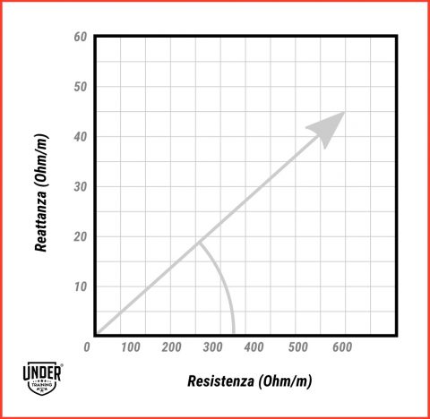
In this graph, the phase angle represents the ratio between resistance and reactance and is measured in degrees, as it is defined by the angle formed between the impedance vector and the x-axis.
If your body were like a jellyfish and made entirely of fluids, the current would pass through very quickly because there would be no barriers (cell membranes) to slow it down, resulting in a phase angle of 0 degrees.
Conversely, if your body were made only of cell membranes with no fluids, the phase angle would be 90 degrees.
A few lines ago, I mentioned that your current physical condition, as measured by the device, is expressed graphically, becoming a single point on a graph.
The strengths of this graphical method of impedance analysis are essentially twofold:
- The ability to have an immediate visual impact, taking a snapshot of the individual’s current physical condition;
- The ability to monitor any changes this individual undergoes in later stages over time.
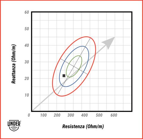
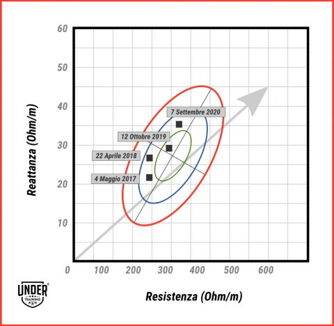
You may have noticed that in these graphs, ellipses also appear.
What are they used for? What do they represent?
The results of the test an individual undergoes can be compared to reference values taken from a similar population, meaning that your results are compared to a group of individuals of the same sex, height, and age.
This group of similar individuals is divided into reference intervals, expressed in percentiles, which are ellipsoidal in shape!
So, here is what those three elongated ellipses on the graph represent:
- The first ellipse includes 50% of the population in terms of hydration and cell mass;
- The second ellipse includes 75% of the population;
- The third, furthest ellipse includes 95% of the population.
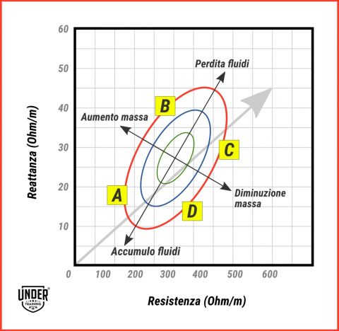
These three ellipses are divided into four areas by two perpendicular axes.
Broadly speaking, we can say that:
- In area A, we find those who have good hydration and a high cell mass;
- In area B, we find those with low hydration but high cell mass;
- In area C, we find individuals with low hydration and low cell mass;
- In area D, we find those with good hydration but low cell mass.
What does this mean?
Let’s go through a couple of examples.
In area A, we might find obese individuals who present a high amount of cellular mass and hydration (water retention).
Area B is where athletes, particularly those in endurance sports like running and biking, are usually located. These individuals have a decent amount of cell mass (in this case, muscle mass) and a low amount of fluid.
In area C, very lean individuals are grouped.
In area D, signs of malnutrition are evident.
Now, let’s take the example of my friend Andreas, who recently stopped playing soccer:
- In 2016, he was a professional soccer player, with his entire day focused on achieving top performance: one or two daily training sessions at his maximum capacity, an excellent muscle structure, and proper hydration.
- By 2018, he had dropped a couple of levels, becoming a semi-professional. The physical demands were lower, and his body adapted. He still had a good amount of cellular mass, though less than two years prior.
- By 2020, he had taken another step back and now plays for an amateur team, training only twice a week plus the match. His body is no longer that of a top athlete and is more comparable to the general population, in line with the average for men of his age and height.
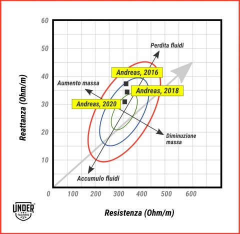
The dot on the graph shifted as his body changed.
As the energy demands decreased, the dot moved from the top left area toward the central area of the ellipses, indicating lower levels of mass and structure.
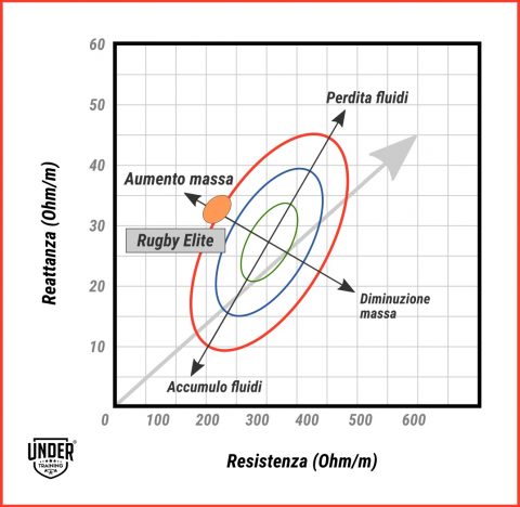
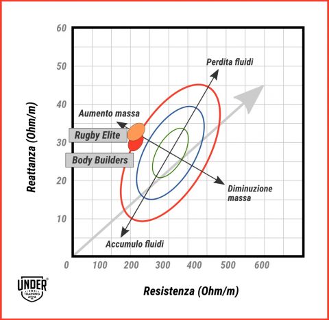
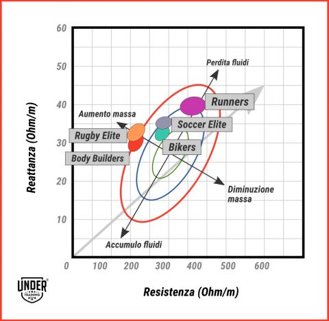
If we were to observe the BIA test of a rugby player, we would see that they are positioned further to the left of the graph than a soccer player, thanks to their generally more muscular build.
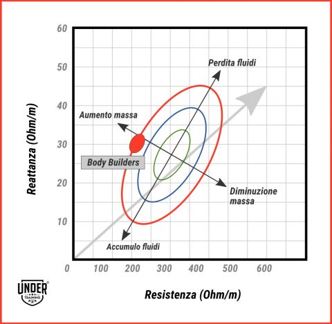
Bodybuilders will also be positioned in the far-left area but slightly lower, indicating higher tissue hydration.
As we mentioned before, endurance athletes like runners or bikers will generally occupy a higher position on the graph, as they have lower hydration levels compared to the reference population but higher mass and structure due to their training.
Another example we can highlight is that of an overweight individual following a body recomposition program, aiming to lose fat and gain muscle mass.
A healthy and correct approach to achieving this goal involves combining a dietary program (created by a professional) with a training regimen aimed at increasing muscle mass.
In our graph, we can see the ideal progression of this hypothetical process:
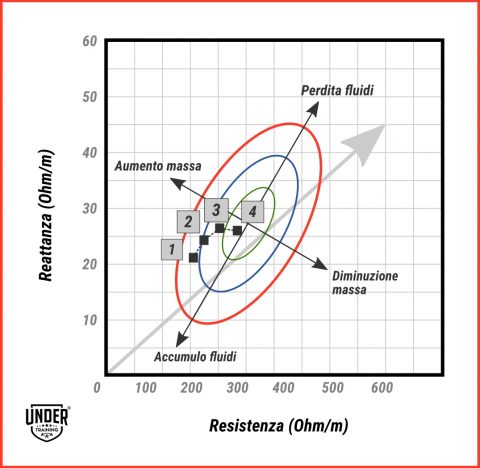
From a position in the bottom left, indicating overhydration and high cellular mass, the goal is to move toward an area higher and to the right, where normohydration and cellular mass are in line with the average population.
After explaining what BIA is, what it assesses, how to read the results, and how to interpret the graph and ellipses, here’s the key takeaway.
It’s not so important where the dot representing the BIA test lands on the graph during the first test, but it’s crucial to track its movement over time, monitoring changes in body composition.
For this reason, it’s essential to organize and undergo periodic follow-up tests to evaluate progress and make any necessary adjustments to your nutrition or training plan.
Before saying goodbye, I’ll ask you one last question.
Where do you think you would land on this graph?
Where will the dot summarizing your bioimpedance analysis and describing your current hydration and nutritional status be positioned?
You can find out by requesting a free consultation, where we will help you understand your situation and the best approach for you.
If you want to discover how to become an even stronger athlete than you are today, join us: choose the From Zero To Hero program and become a super athlete!
SOURCES
Training material for the 1st level Master’s program in Applied Nutrition and Dietetics (A.Y. 2016-2017) by UNITELMA
Koury, J.C., G Torres. “Phase angle and body impedance vectors in adolescent and adult male athletes”. International journal of sports physiology and performance (2014)

